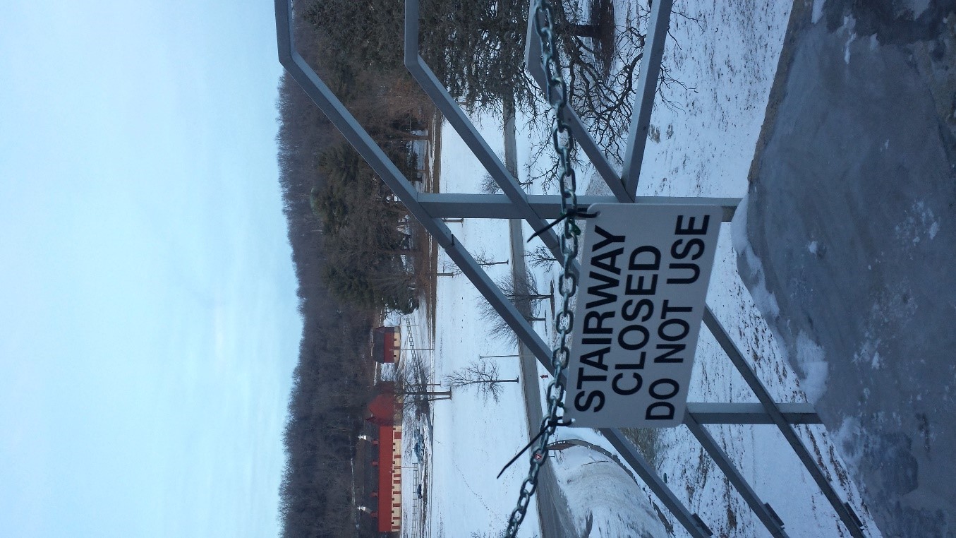
As the photographer, I know “Stairway to Nowhere” is of the sign on the Luther College campus which warns people not to use the staircase which is to the left of the image. This staircase is repaired as often as it crumbles again; students rarely use it and are rarely allowed to use it. I know the staircase is there, but from this perspective, the staircase is but a suggestion, so the primary purpose of the text is disconnected from its intended object. Additionally, I am a Luther College student, so I see versions of this image daily, and it rarely gives me pause anymore. It is when I step back from my knowledge as photographer that I can see the sociological contexts of the image. The main question this picture inspires is how the viewer is supposed to connect the text with the larger picture and how that connection is socially conditioned. I argue that the text is a representation and that through discourse analysis we can understand how the supposed institution which created the sign curates the viewer’s entire experience of the image through the text.
The text in this picture is not a direct representation of the image. There is no staircase in the picture, so at the very least, the text is a representation without a clear object to anchor it. Yet, I still must consider whether such representations “reflect the world as it is, mirroring it back to us through imitation or mimesis, or whether we construct the world and its meaning through representations that are abstract and not mimetic or imitative of physical form” (Sturken 19). Once the viewer realizes the object of the text’s meaning is absent, they should note that the text is not a mimetic representation of anything in the picture. Still, representations “create meaning about the world around us” (Sturken 18), and the abstract meaning of this sign is danger. Thus, it is easy for the viewer to try to attach the danger implied in the message to another object in the image. All that is in the image is the background of a winter landscape. As a viewer, then, the tension is between the representation of danger and the lack of apparent danger in the image; should the image and sense of danger be connected?
The quick answer is no, but the fact that the question need be asked is largely thanks to the power of the implied institution, which can be examined through institutional discourse analysis. This method centers on how our viewing is curated, with “an insistence on the power relations articulated through these practices and institutions…visual images and visualities are articulations of institutional power” (Rose 225). The sign looks official, and we are socially conditioned to avoid danger. This officiality combined with the presumed danger encourages trust of the sign and institution in the viewer. This is because “institutions involve mechanisms that associate noncomformity with increased costs in several different ways” (Phillips 637). Here, the implied cost of not conforming is danger, even though the danger is not visible. Still, we look for it, especially since the image of the sign dominates the frame and is the immediate focus of the work.
The viewer will ultimately realize that the textual representation of danger has nothing to do with the image, but we search for the object of the representation because of the implied authority of the institution and the stated dangers of noncomformity. Thus, it takes us longer to notice the aesthetic qualities of the image as a whole because we are conditioned by the assumed institution to conform to the warning of danger.
Works Cited
Phillips, Nelson, et al. “Discourse and Institutions.” The Academy of Management Review, vol. 29, no. 4, 2004, pp. 635–652. JSTOR.
Rose, Gillian. Visual Methodologies: An Introduction to Researching with Visual Materials. Sage Publications, 2016.
Sturken, Marita, and Lisa Cartwright. Practices of Looking: An Introduction to Visual Culture. Oxford University Press, 2

Commentary on Rachel Tanur's Works: Phlox in Botanical Garden