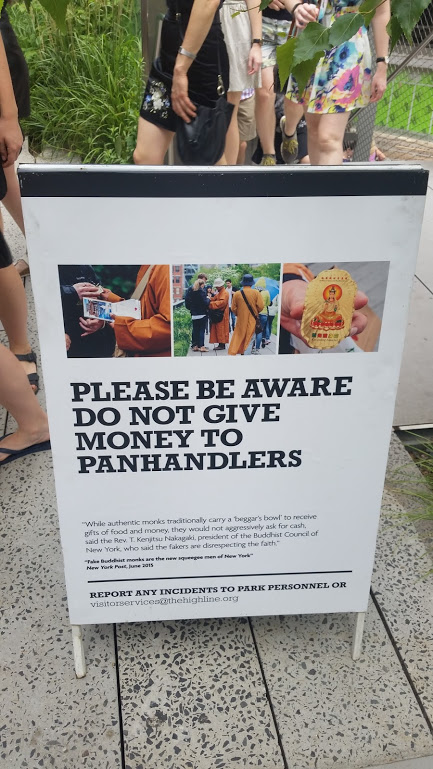
New York City’s High Line Park, constructed in 2009, turned a long-abandoned elevated railroad line on the West Side of Manhattan from a supposed neighborhood eyesore into a popular tourist destination. The High Line is technically a public park, but unlike other well-known New York parks such as Central Park or Prospect Park, its nonprofit partner (the Friends of the High Line) takes responsibility for managing day-to-day activities and programming, including setting rules and guidelines for the use of the space (Loughran 2014). This privatized governance leads to distinct aesthetic markers that differ from traditional park signs and markers, which elsewhere must conform to Parks Department standards. On the High Line, the sensory components of the park communicate particular visual desires and priorities. Many such markers draw the visitor’s eyes to particular phenomena: the Hudson River, the new Whitney Art Museum, and the spacious design typical of buildings in the surrounding Meatpacking District. But the sign in this photograph does the opposite: it advises the viewer where not to look, where not to give their attention.
This sandwich-board sign, on the day that I took this photograph, was positioned by what was at time the northern entrance to the High Line at 30th St. In large bold letters, it practically screams at the viewer from its knee-high placement: DO NOT GIVE MONEY TO PANHANDLERS. By leading with this message, the sign already makes its audience perfectly clear: as any longtime or native New Yorker can tell you, the art of interacting with those asking for money or food has become as much a part of life in the city as swiping a Metrocard to get on the subway. So we know that this sign is for tourists, and that it shouts forth a general statement. For many who pass by, the sign may not even register; as the framing of the photograph demonstrates, most people would have to stop in their tracks and bend down to read it fully, two bodily motions actively discouraged by the design of the High Line. Yet if one were to zoom in on this sign, they would discover a far more specific message than a general screed against those in need. Citing a New York Post article which proclaims that “Fake Buddhist Monks are the new squeegee men of New York,” the board goes on to continue citing the same text in order to tell readers the difference between “real” and inauthentic Buddhist Monks--if, of course, one is willing to read that far into the fine print.
Calling out “new squeegee men,” for New Yorkers and those familiar with the politics of the city, immediately recalls the violence of Broken Windows policing. Under the regime of Rudolph Giuliani in the 1990s, Broken Windows removed homeless people and informal workers alike from highly visible public spaces, a practice sometimes credited with “cleaning up” the city but more accurately understood as kickstarting a vicious pattern of gentrification which still wracks the city today (Smith 1996; Vitale 2008). But on the High Line, there are few if any visibly homeless people, nor can visitors, tourist or New Yorker, see the panhandling that has come to characterize much of Midtown Manhattan in the midst of the gentrification crisis. We can read this sign, along with much of the other visual elements of the High Line, as a form of visual misdirection. It tells us what not to do while attempting to instantiate an imagination, surrounded by the moving legs of those who pass by into its world.
Works Cited
Loughran, K., 2014. Parks for profit: The high line, growth machines, and the uneven development of urban public spaces. City and Community, 13(1), pp.49–68.
Smith, N., 1996. The New Urban Frontier: Gentrification and the Revanchist City, New York: Routledge.
Vitale, A., 2008. City of Disorder: How the Quality of Life Campaign Transformed New York Politics, New York: NYU Press.

Commentary on Rachel Tanur's Works: Drag Queen 2